Implementing Dark Mode in Next.js (App Router) with Tailwind CSS
Dark mode is a nice to have feature for any website these days, and your users love it, why not add them in the first place?
In this article, you will learn how to add dark mode support to a Next.js site that is built around the new App Router and Tailwind.css for styling.
Before we proceed, there's an assumption that you are already familiar with Next.js and Tailwind.css since this tutorial will focus on adding a working dark / light mode that can seamlessly be toggled and rendered on a server rendered Next.js site. To do this, we'll use the following:
- Next.js - The React Framework for the Web
- Tailwind.css - A utility-first CSS framework
- Cookies Next - Getting, setting and removing cookies on both client and server with Next.js
Setup a New Next.js Project
Verify that you are using Node.js v16 and up, then we can now setup the project:
npx create-next-app@latest --experimental-app
Here's how I setup mine:

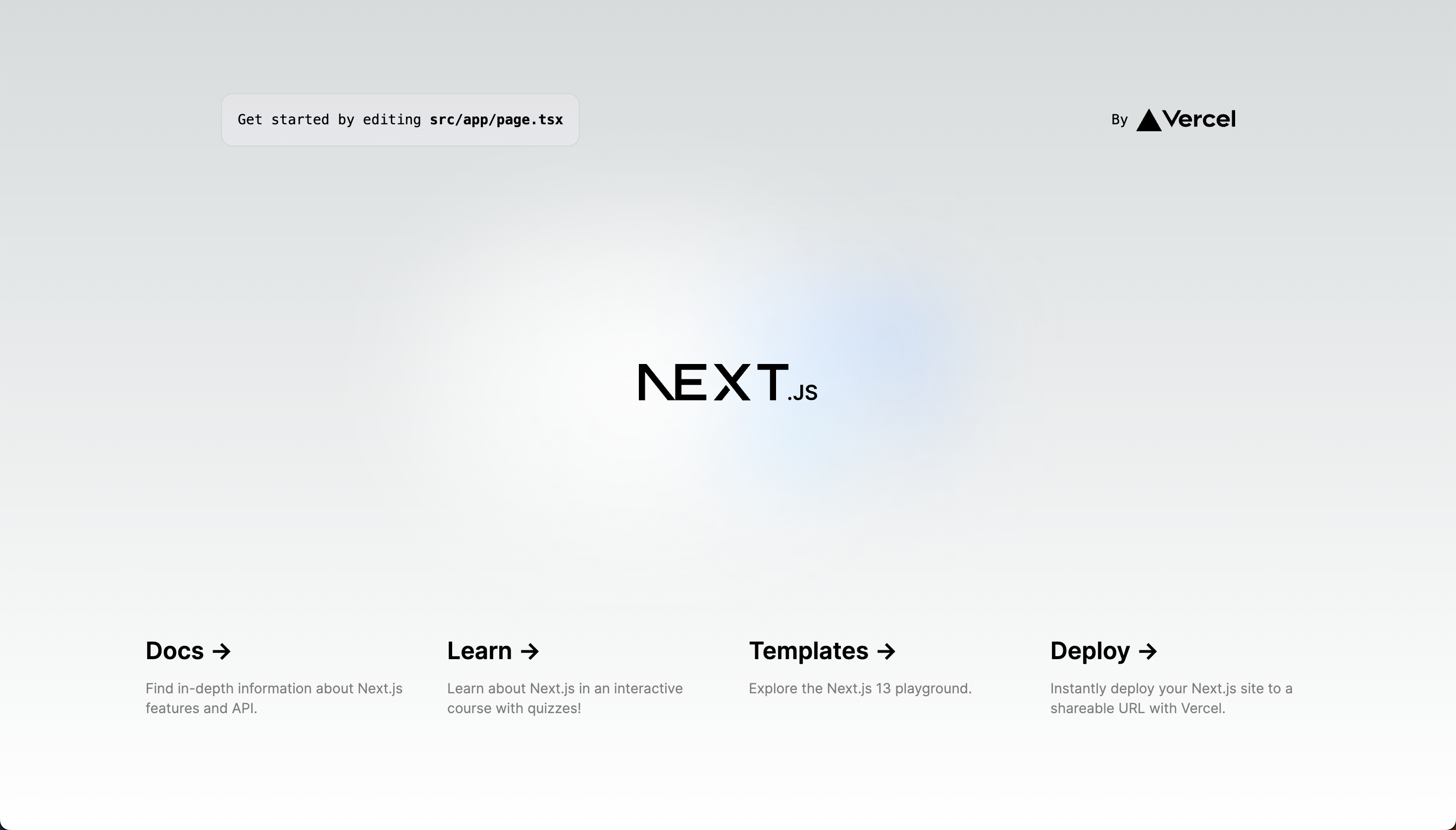
Finally, run npm run dev and view the welcome page:

Enabling Dark Mode in Tailwind
Let's enable dark mode in Tailwind, add the darkMode: 'class' in tailwind.config.js:
/** @type {import('tailwindcss').Config} */
module.exports = {
  content: [
    './src/pages/**/*.{js,ts,jsx,tsx}',
    './src/components/**/*.{js,ts,jsx,tsx}',
    './src/app/**/*.{js,ts,jsx,tsx}',
  ],
+ darkMode: 'class',
  theme: {
    extend: {
      backgroundImage: {
        'gradient-radial': 'radial-gradient(var(--tw-gradient-stops))',
        'gradient-conic':
          'conic-gradient(from 180deg at 50% 50%, var(--tw-gradient-stops))',
      },
    },
  },
  plugins: [],
};
By doing so, we can easily "invert" the colors when the app is in Dark mode, for example: className="bg-zinc-50 dark:bg-zinc-900" and so on.
Now let's try it inside the home page: src/app/page.tsx, let's remove the boilerplate code shipped by Next.js and display a welcome message to start.
- import Image from 'next/image'
- import { Inter } from 'next/font/google'
-
- const inter = Inter({ subsets: ['latin'] })
export default function Home() {
return (
- <main className="flex min-h-screen flex-col items-center justify-between p-24">
+ <main className="bg-zinc-50 dark:bg-zinc-900 flex min-h-screen items-center justify-center">
+ <div className="max-w-xs mx-auto">
+ <h1 className="text-lg text-center text-zinc-900 dark:text-zinc-100">Dark mode example</h1>
+
+ <p className="text-sm text-center text-zinc-700 dark:text-zinc-100">
+ This is an example of how to implement dark mode in a Next.js app.
+ </p>
+ </div>
- <div className="z-10 w-full max-w-5xl items-center justify-between font-mono text-sm lg:flex">
- <p className="fixed left-0 top-0 flex w-full justify-center border-b border-gray-300 bg-gradient-to-b from-zinc-200 pb-6 pt-8 backdrop-blur-2xl dark:border-neutral-800 dark:bg-zinc-800/30 dark:from-inherit lg:static lg:w-auto lg:rounded-xl lg:border lg:bg-gray-200 lg:p-4 lg:dark:bg-zinc-800/30">
- Get started by editing
- <code className="font-mono font-bold">src/app/page.tsx</code>
- </p>
- <div className="fixed bottom-0 left-0 flex h-48 w-full items-end justify-center bg-gradient-to-t from-white via-white dark:from-black dark:via-black lg:static lg:h-auto lg:w-auto lg:bg-none">
- <a
- className="pointer-events-none flex place-items-center gap-2 p-8 lg:pointer-events-auto lg:p-0"
- href="https://vercel.com?utm_source=create-next-app&utm_medium=appdir-template&utm_campaign=create-next-app"
- target="_blank"
- rel="noopener noreferrer"
- >
- By{' '}
- <Image
- src="/vercel.svg"
- alt="Vercel Logo"
- className="dark:invert"
- width={100}
- height={24}
- priority
- />
- </a>
- </div>
- </div>
-
- <div className="relative flex place-items-center before:absolute before:h-[300px] before:w-[480px] before:-translate-x-1/2 before:rounded-full before:bg-gradient-radial before:from-white before:to-transparent before:blur-2xl before:content-[''] after:absolute after:-z-20 after:h-[180px] after:w-[240px] after:translate-x-1/3 after:bg-gradient-conic after:from-sky-200 after:via-blue-200 after:blur-2xl after:content-[''] before:dark:bg-gradient-to-br before:dark:from-transparent before:dark:to-blue-700 before:dark:opacity-10 after:dark:from-sky-900 after:dark:via-[#0141ff] after:dark:opacity-40 before:lg:h-[360px]">
- <Image
- className="relative dark:drop-shadow-[0_0_0.3rem_#ffffff70] dark:invert"
- src="/next.svg"
- alt="Next.js Logo"
- width={180}
- height={37}
- priority
- />
- </div>
-
- <div className="mb-32 grid text-center lg:mb-0 lg:grid-cols-4 lg:text-left">
- <a
- href="https://beta.nextjs.org/docs?utm_source=create-next-app&utm_medium=appdir-template&utm_campaign=create-next-app"
- className="group rounded-lg border border-transparent px-5 py-4 transition-colors hover:border-gray-300 hover:bg-gray-100 hover:dark:border-neutral-700 hover:dark:bg-neutral-800/30"
- target="_blank"
- rel="noopener noreferrer"
- >
- <h2 className={`${inter.className} mb-3 text-2xl font-semibold`}>
- Docs{' '}
- <span className="inline-block transition-transform group-hover:translate-x-1 motion-reduce:transform-none">
- ->
- </span>
- </h2>
- <p
- className={`${inter.className} m-0 max-w-[30ch] text-sm opacity-50`}
- >
- Find in-depth information about Next.js features and API.
- </p>
- </a>
-
- <a
- href="https://nextjs.org/learn?utm_source=create-next-app&utm_medium=appdir-template-tw&utm_campaign=create-next-app"
- className="group rounded-lg border border-transparent px-5 py-4 transition-colors hover:border-gray-300 hover:bg-gray-100 hover:dark:border-neutral-700 hover:dark:bg-neutral-800 hover:dark:bg-opacity-30"
- target="_blank"
- rel="noopener noreferrer"
- >
- <h2 className={`${inter.className} mb-3 text-2xl font-semibold`}>
- Learn{' '}
- <span className="inline-block transition-transform group-hover:translate-x-1 motion-reduce:transform-none">
- ->
- </span>
- </h2>
- <p
- className={`${inter.className} m-0 max-w-[30ch] text-sm opacity-50`}
- >
- Learn about Next.js in an interactive course with quizzes!
- </p>
- </a>
-
- <a
- href="https://vercel.com/templates?framework=next.js&utm_source=create-next-app&utm_medium=appdir-template&utm_campaign=create-next-app"
- className="group rounded-lg border border-transparent px-5 py-4 transition-colors hover:border-gray-300 hover:bg-gray-100 hover:dark:border-neutral-700 hover:dark:bg-neutral-800/30"
- target="_blank"
- rel="noopener noreferrer"
- >
- <h2 className={`${inter.className} mb-3 text-2xl font-semibold`}>
- Templates{' '}
- <span className="inline-block transition-transform group-hover:translate-x-1 motion-reduce:transform-none">
- ->
- </span>
- </h2>
- <p
- className={`${inter.className} m-0 max-w-[30ch] text-sm opacity-50`}
- >
- Explore the Next.js 13 playground.
- </p>
- </a>
-
- <a
- href="https://vercel.com/new?utm_source=create-next-app&utm_medium=appdir-template&utm_campaign=create-next-app"
- className="group rounded-lg border border-transparent px-5 py-4 transition-colors hover:border-gray-300 hover:bg-gray-100 hover:dark:border-neutral-700 hover:dark:bg-neutral-800/30"
- target="_blank"
- rel="noopener noreferrer"
- >
- <h2 className={`${inter.className} mb-3 text-2xl font-semibold`}>
- Deploy{' '}
- <span className="inline-block transition-transform group-hover:translate-x-1 motion-reduce:transform-none">
- ->
- </span>
- </h2>
- <p
- className={`${inter.className} m-0 max-w-[30ch] text-sm opacity-50`}
- >
- Instantly deploy your Next.js site to a shareable URL with Vercel.
- </p>
- </a>
- </div>
</main>
)
}
With that in place we can quickly toggle the dark mode by adding a dark class in the <html> tag, let's go ahead and add it, update the src/app/layout.tsx file:
import './globals.css'

export const metadata = {
  title: 'Create Next App',
  description: 'Generated by create next app',
}

export default function RootLayout({
  children,
}: {
  children: React.ReactNode
}) {
  return (
-    <html lang="en">
+    <html lang="en" className="dark">
      <body>{children}</body>
    </html>
  )
}
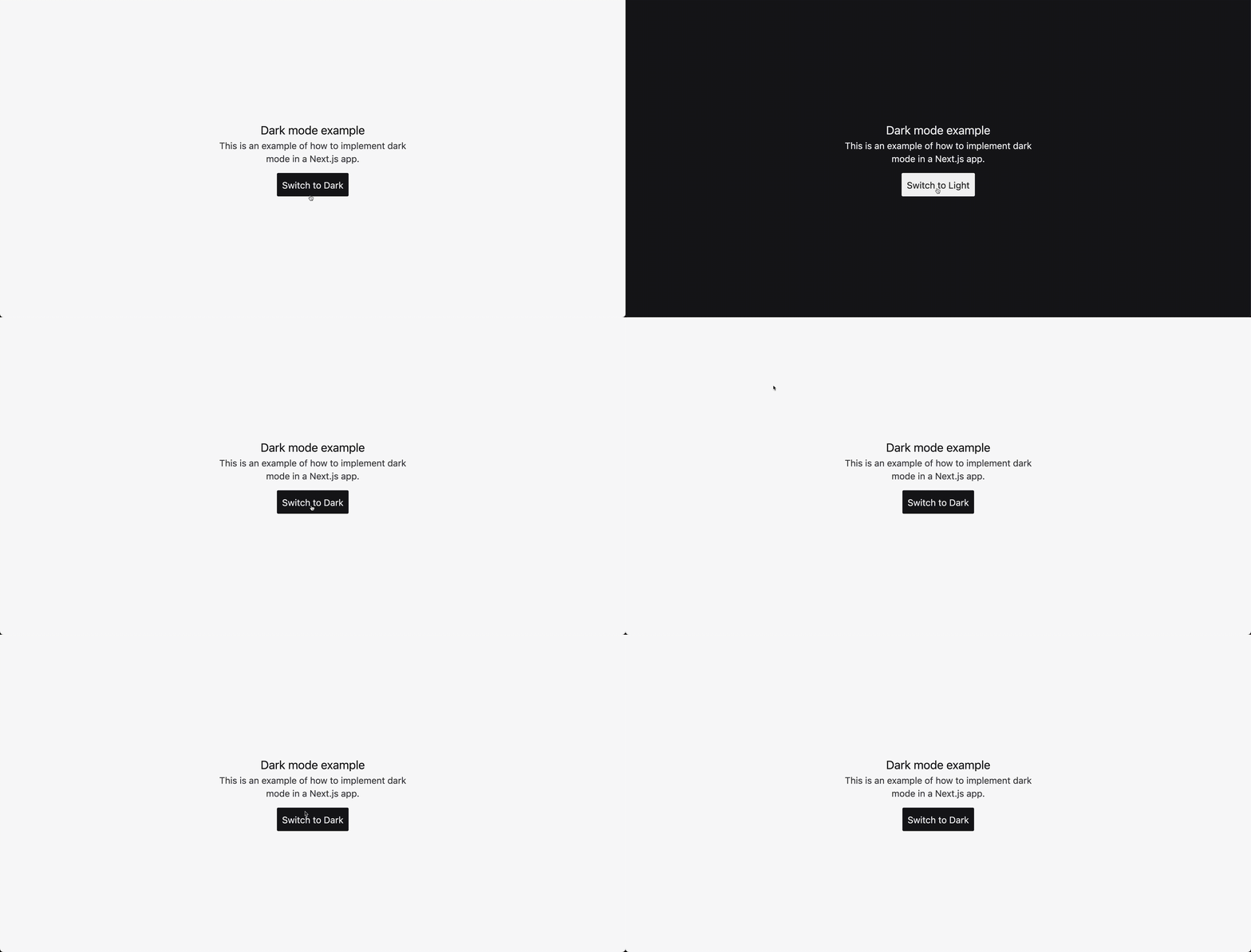
Observe that the background and text of the page is darkened, and that's how we would like to toggle it.
Add the Toggle Button
Now let's create a component to toggle in between dark and light modes: src/components/color-scheme-toggle-button.tsx.
export default function ColorSchemeToggleButton() {
  return (
    <button
      type="button"
      aria-label="Toggle dark mode"
      className="px-2 py-1.5 rounded-sm bg-zinc-900 dark:bg-zinc-100"
    >
      <span className="inline-block text-sm dark:hidden text-zinc-100">Switch to Dark</span>
      <span className="hidden text-sm dark:inline-block text-zinc-800">Switch to Light</span>
    </button>
  );
}
As you can see, the button component will contain a "Switch to Dark" text and a dark background if the app is in light mode, while containing a "Switch to Light" text and a light background when on dark mode. Let's go ahead and import it in the page src/app/page.tsx:
+ import ColorSchemeToggleButton from '@/components/color-scheme-toggle-button';

export default function Home() {
  return (
    <main className="flex items-center justify-center min-h-screen bg-zinc-50 dark:bg-zinc-900">
      <div className="max-w-xs mx-auto">
        <h1 className="text-lg text-center text-zinc-900 dark:text-zinc-100">
          Dark mode example
        </h1>

        <p className="text-sm text-center text-zinc-700 dark:text-zinc-100">
          This is an example of how to implement dark mode in a Next.js app.
        </p>

+       <div className="flex items-center justify-center mt-3">
+         <ColorSchemeToggleButton></ColorSchemeToggleButton>
+       </div>
      </div>
    </main>
  );
}
Now, let's add the the behavior that will add and remove the dark class in the html tag in our <Layout />. First thing we need to do is attach an onClick event listener to our ColorSchemeToggleButton component, but it's important to understand that at this point, the component is a React Server Component and we could not attach an event listener here (yet), we can do so by adding the use client directive at the top of the file. This will tell Next.js that it's a client only component.
+ 'use client';

export default function ColorSchemeToggleButton() {
+ const toggle = async () => {
+   console.log('Toggling dark mode...');
+ };

  return (
    <button
      type="button"
      aria-label="Toggle dark mode"
      className="px-2 py-1.5 rounded-sm bg-zinc-900 dark:bg-zinc-100"
+     onClick={toggle}
    >
      <span className="inline-block text-sm dark:hidden text-zinc-100">
        Switch to Dark
      </span>
      <span className="hidden text-sm dark:inline-block text-zinc-800">
        Switch to Light
      </span>
    </button>
  );
}
💡 Try it and it should log the message to the browser console.
Persisting The Color Scheme
Of course we want to store whether the colorScheme is dark, light so that after toggling it the app will retain the same color scheme even after reloading the app.
If you have already added a Dark mode support with Next.js and other frontend frameworks before, it will tell you to store the color scheme value using Local Storage and it makes sense to do so, considering that React Server Components is a relatively new feature, it just so happen that Next.js 13+ utilizes this even more and moving forward I think this is the future of React in general.
We can't really use Local Storage since it's only accessible in the window, we'll use the Cookies Next package along side the cookies() utility from next/headers. to store and access the color scheme.
Let's install the package first:
npm install --save cookies-next
Now let's add a new utility src/utils/colorScheme.ts and add a getCurrentScheme function:
import { getCookie } from 'cookies-next';

export const getCurrentScheme = async () => {
  // The `getCookie` function is not available on the server, imagine that
  // we have to access the scheme while Next.js is rendering the `<RootLayout />`
  // component (this happens server side). We can use the `cookies` function
  // from the `next/headers` package to access the cookies from the request headers.
  if (typeof window === 'undefined') {
    return import('next/headers').then(({ cookies }) => {
      return cookies().has('scheme') ? cookies().get('scheme')?.value : 'light';
    });
  }

  return getCookie('scheme', { path: '/' });
};
Now let's add the toggleScheme function:
- import { getCookie } from 'cookies-next';
+ import { getCookie, setCookie } from 'cookies-next';

export const getCurrentScheme = async () => {
  // The `getCookie` function is not available on the server, imagine that
  // we have to access the scheme while Next.js is rendering the `<RootLayout />`
  // component (this happens server side). We can use the `cookies` function
  // from the `next/headers` package to access the cookies from the request headers.
  if (typeof window === 'undefined') {
    return import('next/headers').then(({ cookies }) => {
      return cookies().has('scheme') ? cookies().get('scheme')?.value : 'light';
    });
  }

  return getCookie('scheme', { path: '/' });
};

+ export const toggleScheme = async () => {
+   const scheme = await getCurrentScheme();
+
+   const newScheme = scheme === 'dark' ? 'light' : 'dark';
+
+   setCookie('scheme', newScheme, {
+     path: '/',
+   });
+
+   return newScheme;
+ };
We now have the two utilities we need to access and update the color scheme, let's go ahead and use them in our <ColorSchemeToggleButton /> component:
'use client';

+ import { toggleScheme } from '@/utils/colorScheme';


export default function ColorSchemeToggleButton() {
  const toggle = async () => {
-   console.log('Toggling dark mode...');
+   await toggleScheme();
  };

  return (
    <button
      type="button"
      aria-label="Toggle dark mode"
      className="px-2 py-1.5 rounded-sm bg-zinc-900 dark:bg-zinc-100"
      onClick={toggle}
    >
      <span className="inline-block text-sm dark:hidden text-zinc-100">
        Switch to Dark
      </span>
      <span className="hidden text-sm dark:inline-block text-zinc-800">
        Switch to Light
      </span>
    </button>
  );
}
Right now it won't do much but update the scheme cookie, let's utilize this value and set / unset the dark class in our <RootLayout /> component:
import './globals.css'
+ import { getCurrentScheme } from '@/utils/colorScheme';

export const metadata = {
  title: 'Create Next App',
  description: 'Generated by create next app',
}

- export default async function RootLayout({
+ export default async function RootLayout({
  children,
}: {
    children: React.ReactNode
}) {
+ const scheme = await getCurrentScheme();

  return (
-   <html lang="en">
+   <html lang="en" className={scheme === 'dark' ? 'dark' : ''}>
      <body>{children}</body>
    </html>
  )
}
As you can notice, it doesn't toggle it instantaneously but reloading the page will do so, we just have to do one more thing before it updates instantly upon clicks, in our <ColorSchemeToggleButton /> component, let's utilize the useRouter hook from Next.js:
'use client';

+ import { useRouter } from 'next/navigation';
import { toggleScheme } from '@/utils/colorScheme';

export default function ColorSchemeToggleButton() {
+ const router = useRouter();

  const toggle = async () => {
    await toggleScheme();

+   router.refresh();
  };

  return (
    <button
      type="button"
      aria-label="Toggle dark mode"
      className="px-2 py-1.5 rounded-sm bg-zinc-900 dark:bg-zinc-100"
      onClick={toggle}
    >
      <span className="inline-block text-sm dark:hidden text-zinc-100">
        Switch to Dark
      </span>
      <span className="hidden text-sm dark:inline-block text-zinc-800">
        Switch to Light
      </span>
    </button>
  );
}
That's it! a Dark Mode support that works in server rendered Next.js sites

A copy of the repo where this tutorial is hosted can be found here.
